Proven Performance in Real-World Scenarios
Imputation Benchmarking
We tested 12 different ways to fill in missing data using two sets of proteomics data. One set came from Astral DDA/DIA with 30 samples in two groups, and the other was the Fudan dataset with 15 groups, each with 4 samples tested three times on different machines.
For the DDA/DIA data, we kept the same amount of missing data as the original and compared how well each method worked using two measures: nRMSE (lower is better) and avgCor (higher is better). We found that methods like impSeqRob, impSeq, and BPCA, which use global patterns, worked the best with the highest avgCor and lowest nRMSE.
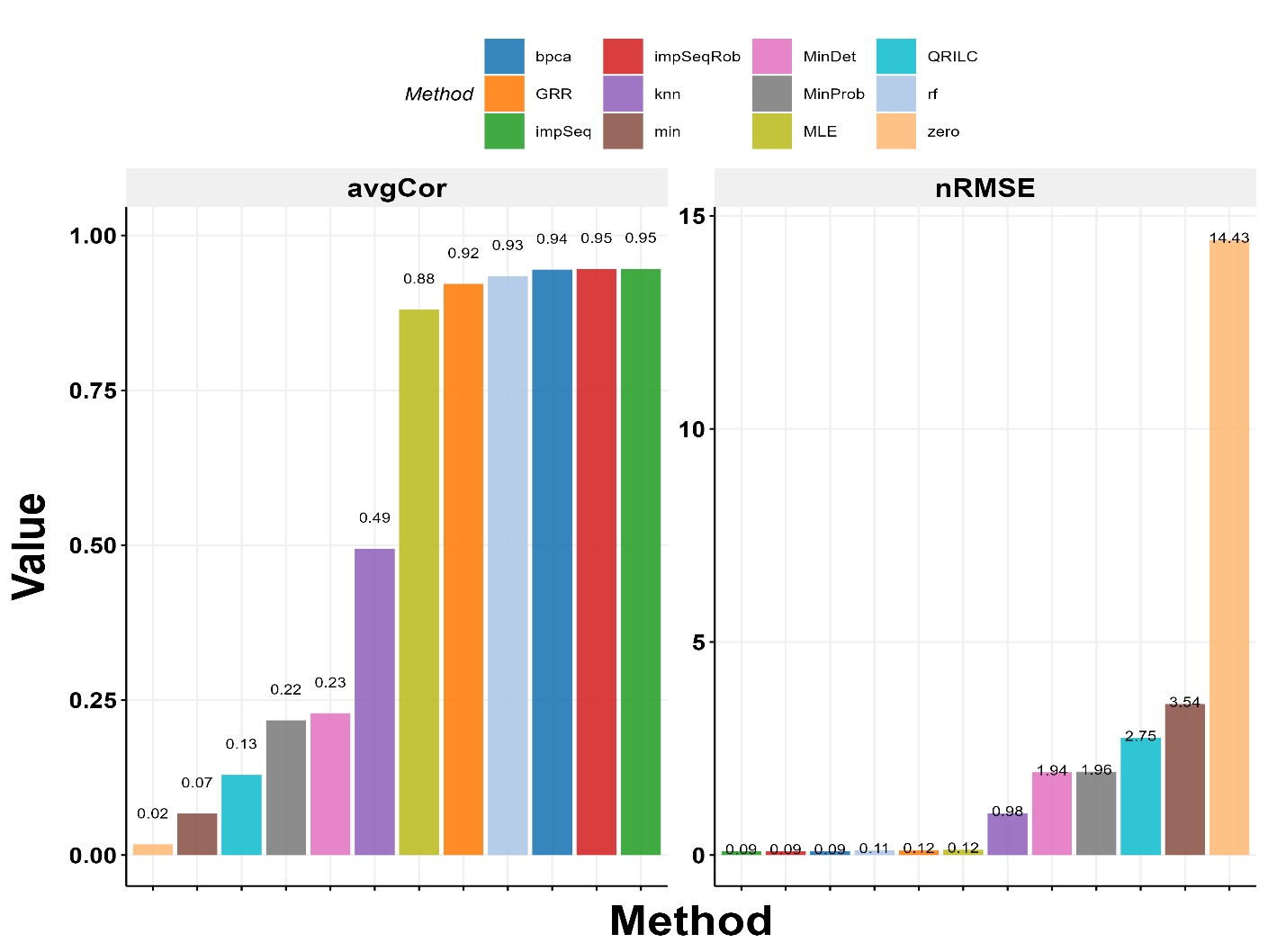
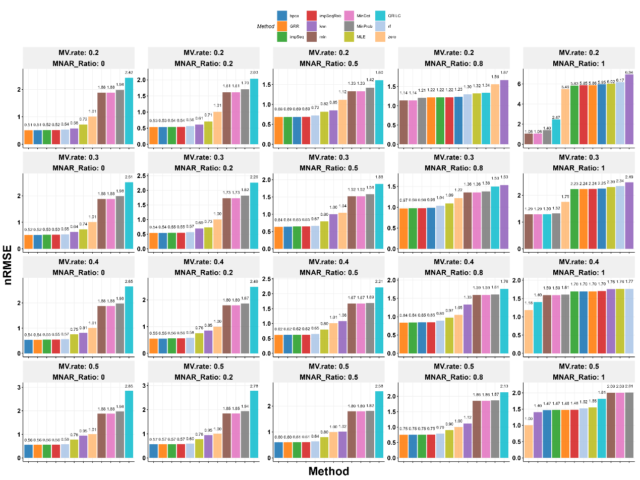
For the Fudan data, we used only the first 30 samples because running BPCA on all 180 was too slow. Since there were no missing values originally, we added some artificially based on a method by Jin et al. We tested different levels of missing data (20% to 50%) and randomness (0 to 100%) across 10 datasets for each level. The results showed that BPCA, GRR, impSeq, and impSeqRob were the top performers when randomness was not too high (up to 80%). Simple methods like min and MinDet only worked best when all data was missing randomly, which is rare. As more data went missing, even the best methods got slightly worse. We chose BPCA for ProteoIntegrator because it handles large datasets well with parallel processing.
Multi-Instrument Correction
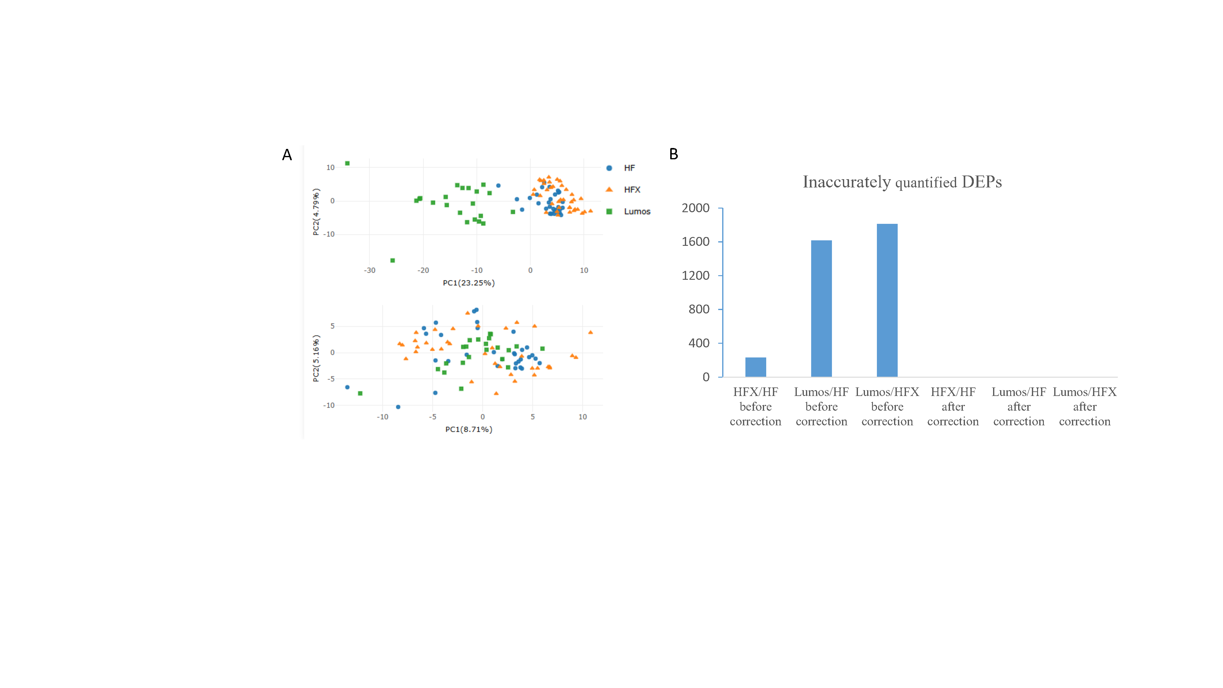
In labs, 293T cell peptides are often used daily to check how well mass spectrometers are working, but differences in machine performance can change protein results. We tested if ProteoIntegrator could fix these differences using 91 samples run on QE HF, QE-HFX, and Orbitrap Lumos machines over 7 years from two labs. Before fixing, a graph (PCA) showed the HF and HFX data grouped together, separate from Lumos, meaning machine differences affected the results. Using a cutoff of 1.5 times change and P < 0.05, we found 232 proteins differed between HFX and HF, 1,617 between Lumos and HF, and 1,813 between Lumos and HFX. After using ProteoIntegrator, no differing proteins were found, and the data from all machines looked even, proving the tool successfully removed these machine effects.
Data Integration
Proteomics can use labeling or label-free methods, like DDA or DIA, and different analysis tools can give different results. Combining these methods is hard without fixing batch effects.
We made two mixes of E. coli and human peptides at 1:20 and 1:40 ratios and tested them with DIA (7, 24, 60 minutes) and DDA (24, 60 minutes) on an Orbitrap Astral, each three times. Before fixing, a graph (PCA) showed the data grouped by method. After using ProteoIntegrator, the 1:20 and 1:40 groups separated clearly, showing the tool fixed the method differences.
From six 24-minute DDA runs, we found 457 E. coli proteins, with 324 as different (DEPs) and 13 human proteins wrongly marked. After correction with ProteoIntegrator, this rose to 1,273 E. coli DEPs with only 14 human errors, while HarmonizR found just 285. Comparing 7-minute DIA (1:40) and 24-minute DDA (1:20), we got 1,158 DEPs at 99.7% accuracy after correction, versus 371 with HarmonizR without correction. This shows the tool works well even with different run times.
We also tested single runs; 24-minute DDA (1:20 vs. 1:40) gave 707 DEPs at 84.6% accuracy after correction, up from 388 at 78.4% before, proving reliability with few samples. The graph post-correction showed clear 1:20 and 1:40 separation.
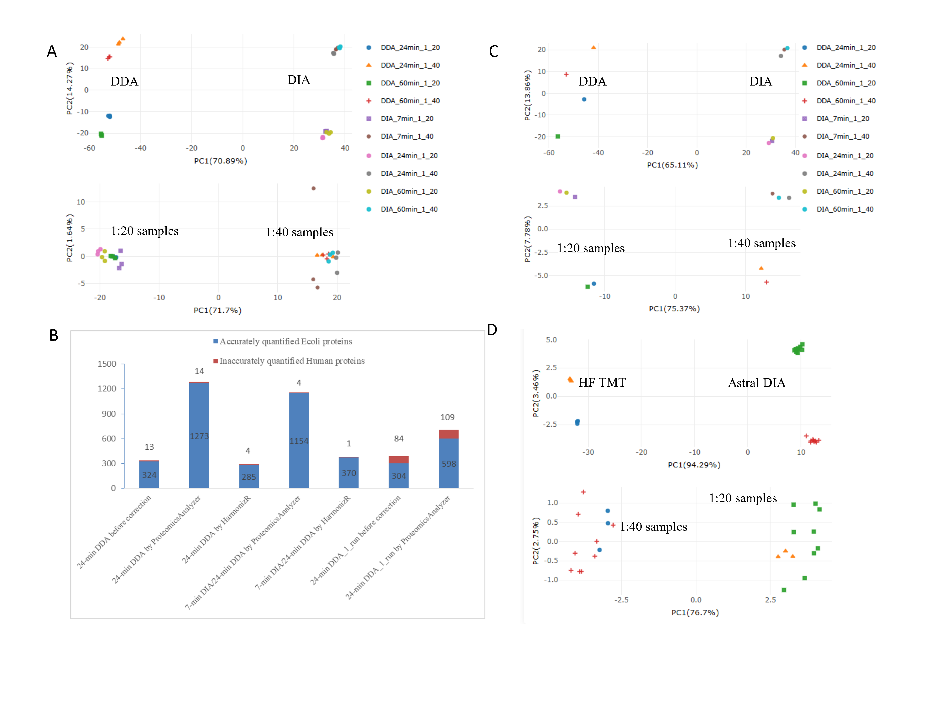
Labeling methods like TMT can compress data, making it hard to mix with label-free data. We combined 6-plex TMT data from 2017 on a Q Exactive HF with 2024 DIA data on an Orbitrap Astral. Before fixing, the graph showed separate groups by method. After correction, these differences were gone despite the seven-year gap.
In TMT, we found 1,051 E. coli DEPs at 1.2-fold change; after correction, this rose to 1,345 at 1.3-fold, suggesting compression was reduced. HarmonizR found only 1,090. Comparing 7-minute DIA (1:40) with 20 two-hour TMT-DDA (1:20), we got 1,231 DEPs at 98.1% accuracy post-correction, versus 612 with HarmonizR, showing the tool handles labeling issues well.
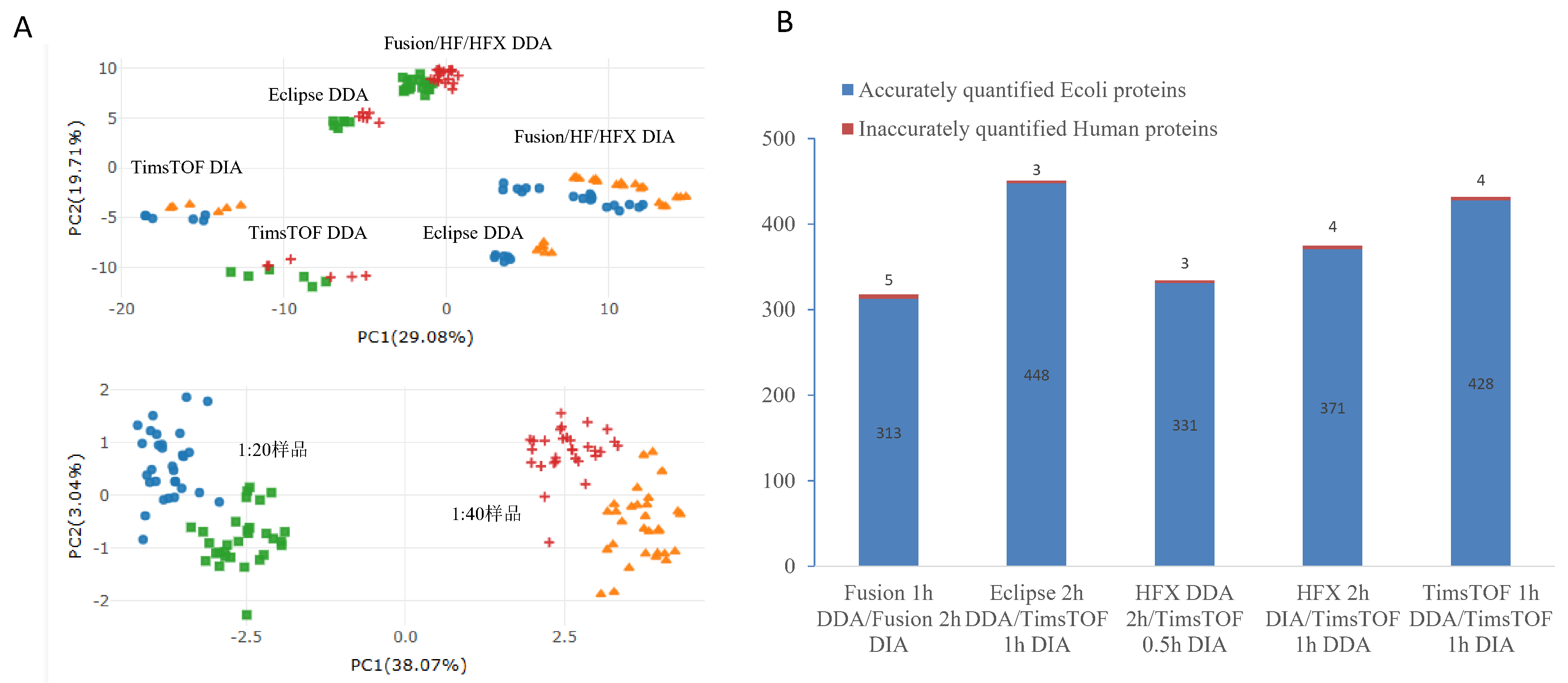
We also tested five machines (Orbitrap Fusion, HF, HFX, Eclipse, TimsTOF Pro 2) with different run times (30/60/120 minutes), column sizes (15/25/50 cm), and methods (DDA/DIA), each three times. Before fixing, data grouped by machine and method. After ProteoIntegrator, it grouped by E. coli level (1:20 vs. 1:40), confirming effective correction.
We measured E. coli DEPs across setups: Fusion Lumos (1h DDA vs. 2h DIA) gave 313 DEPs; Eclipse (2h DDA) vs. TimsTOF Pro 2 (1h DIA) gave 448; HFX (2h DDA) vs. TimsTOF Pro 2 (0.5h DIA) gave 331; HFX (2h DIA) vs. TimsTOF Pro 2 (1h DDA) gave 371; TimsTOF Pro 2 (1h DDA vs. 1h DIA) gave 428. Each had 3-5 human false DEPs, with accuracy from 98.4% to 99.3%, showing the tool works across different lab setups.
Public Dataset Harmonization
How samples are stored and when they’re analyzed can cause differences in proteomics studies, especially over years. We tested if ProteoIntegrator could fix this using two kidney tumor datasets: one with 103 samples using TMT from 2019, and another with 470 samples using DIA from 2023, from different labs. After correction, the data grouped by tissue type (normal, control, tumor). We found 2,608 DEPs in DIA, 3,035 in TMT, and 2,948 in the combined data, proving the tool helps uncover changes in kidney cancer (clear cell renal carcinoma or ccRCC).
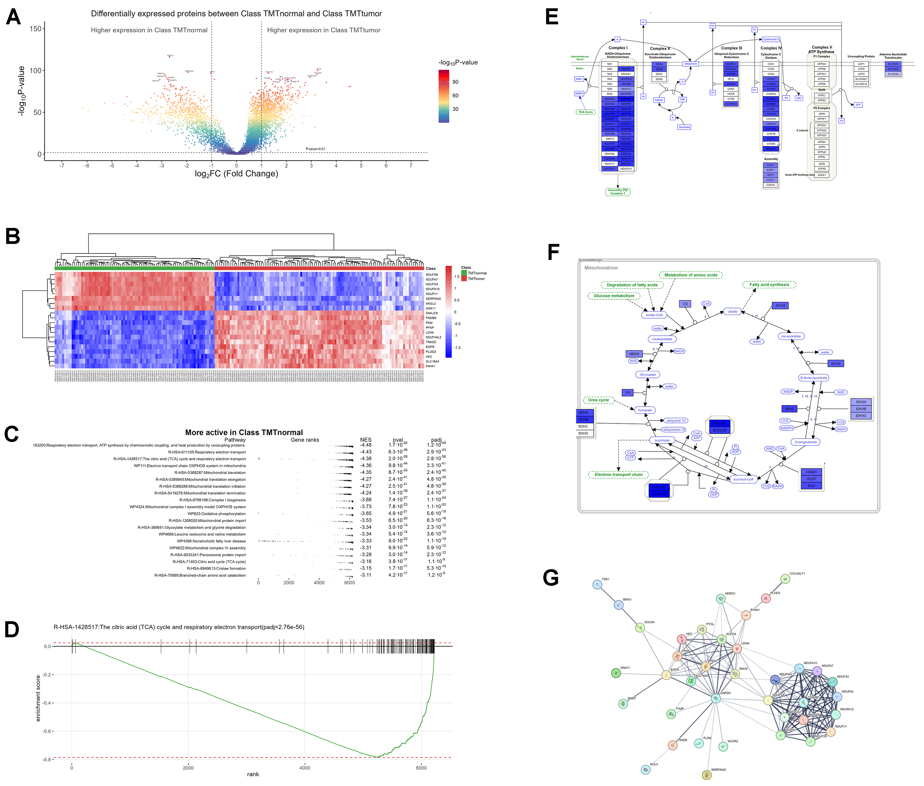
In ccRCC, gene changes cause metabolic shifts: more activity in low-oxygen signals, cell growth, and sugar use, but less in energy production (OXPHOS), fat use, and the TCA cycle, partly due to HIF-1α/2α effects.
A volcano plot showed many proteins less active in tumors (blue) and more active in sugar and growth processes (red), based on p-value colors. A heatmap clearly separated normal samples (high energy proteins) from tumors (high low-oxygen proteins).
Key pathways in normal tissues like TCA cycle, electron transport, and OXPHOS were less active in tumors, showing a metabolic switch. A rank plot confirmed this drop in tumor activity. A diagram of OXPHOS complexes (I-V) used colors to show less activity in tumors (blue) and some increase (red), matching weaker energy use. A TCA cycle diagram also showed less activity in tumors, linking to fat and protein breakdown changes.
A network graph highlighted protein interactions in ccRCC, showing how gene changes (VHL, HIF) shift metabolism toward sugar use and away from energy production, with clusters for energy hubs, sugar transport, and breakdown processes.